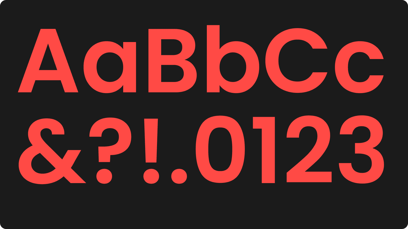
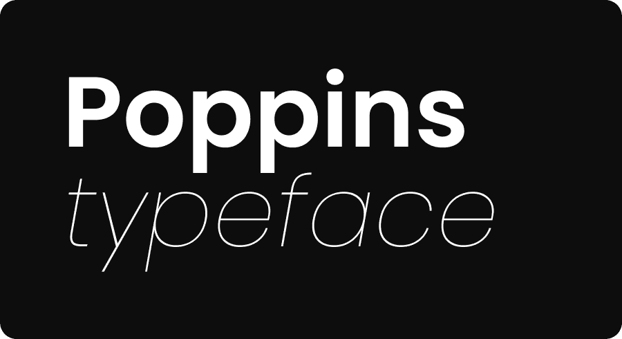
Our typography is contemporary and balances clarity, elegance and modernity. Allows flexibility in typographic design.
Family Name
Poppins is known for its clean, modern appearance, making it versatile for a variety of design applications. This sans-serif font features geometric shapes and a balanced structure, providing clear and pleasant reading in various sizes.
Light
Aa Bb Cc Dd Ee Ff Gg Hh Ii Jj Kk Ll Mm Nn Pp Qq Rr Ss Tt Uu Vv Xx Zz
Regular
Aa Bb Cc Dd Ee Ff Gg Hh Ii Jj Kk Ll Mm Nn Pp Qq Rr Ss Tt Uu Vv Xx Zz
Bold
Aa Bb Cc Dd Ee Ff Gg Hh Ii Jj Kk Ll Mm Nn Pp Qq Rr Ss Tt Uu Vv Xx Zz
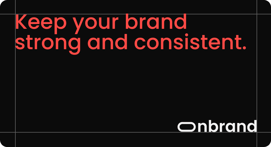
Type margins
Adjusting type margins is a key typographic consideration, allowing designers to strike a balance between readability, visual harmony, and efficient use of space in various design contexts.
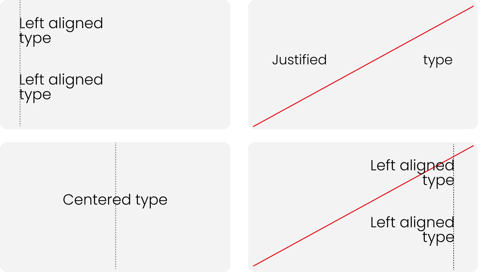
Alignment
Left alignment creates a uniform edge on the right, providing a smooth reading experience and easy tracking of the text. On the other hand, centered alignment imparts a balanced aesthetic and is often applied to titles and prominent elements.
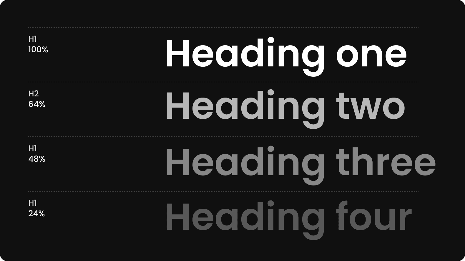
Hierarchy tones
The hierarchy of tones allows for highlighting important information and guiding the reader through the content intuitively. Headings often feature heavier tones to stand out, while the body text may have lighter tones to ensure a smooth reading
