Our logo serves as the foundation of our brand system. It embodies the efficiency and enjoyment that our product enables, encapsulating a narrative that aligns with our commitment to crafting meaningful experiences for our customers.
Concept
The light switch was chosen as the central symbol for the onbrand because of its direct connection to the on and off action. This action represents, in a symbolic way, control, activation, which are fundamental elements that we want to transmit through the brand.
Switch symbol
Our symbol is a switch, in minimalist language, it symbolizes the change to be on and active. The symbol replaces the letter "o" in the brand's typology.
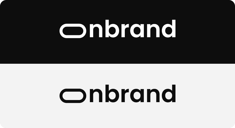
Black & white
The Onbrand brand application in black and white stands out for its timeless elegance and simplicity. This monochromatic application emphasizes the strength of the design and the timeless essence of the brand, highlighting its presence in an impactful way.
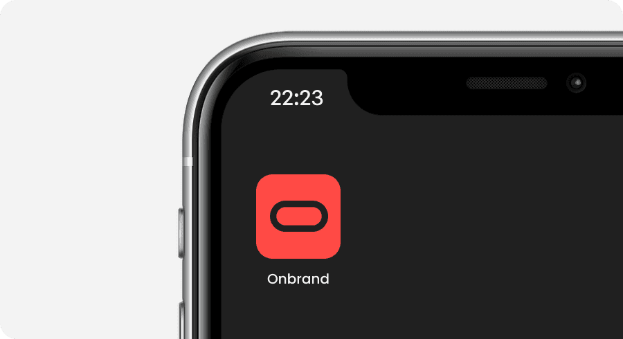
App Icon
These are our application icons. It should not be used in place of our logo in other applications.
Grid
The careful application of Onbrand branding to a grid or constructive mesh demonstrates a commitment to precision and visual cohesion. This systematic approach to branding not only ensures a visually pleasing aesthetic, but also makes it easier to adapt the visual identity to different formats.
Logo colors
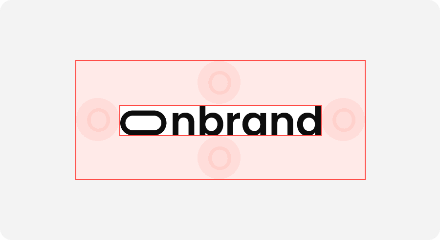
Clearspace
The diagram shows the formula for creating the minimum margin of space around our logo.
Minimum Size
For better readability and legibility: Do not size our logo below these sizes.


